Wednesday, February 7, 2018

Society of the Owl Women - A Spirit Animal Collaboration


In late 2016, Holly, Sofia and I started an owl theme collaboration. We were taking the Rituals class offered by Get Messy Art Journal and all had made spreads on the Owl as our totem/spirit animal. The journals are all back home so we're sharing the completed spreads. It's great to look back to see what style of pages I was making at the time. 

I'm going to start by sharing my completed journal and then share the spreads I made for Holly and Sofia's. Holly and Sofia are also sharing their completed journals so please check out their blogs. I can't wait to see them myself!


Sofia's spread turned out to be such a nice companion to the spread I made on the previous page.


I love the background Holly made for this spread. It's simple but adds such a level of interest.


The way Holly made the words look this the wind behind the owl is so lovely. And the forest background! 


This is such a great reminder from Sofia. Especially with spirit animals, it so easy to forget the playful nature of animals. 


I like to imagine that this is a giant owl spirit in Holly's last spread, especially in comparison to the female figure. 


Sofia added French to the journal and my sister kindly translated it for me. "Messenger of the gods, you reveal the mysteries of the universe and open our eyes to the sacred secrets of the invisible, unseen world hidden to the unenlightened." I absolute love this!


The next three photos are the spreads I made for Holly's journal. 


And these I made for Sofia's. 


Monday, February 5, 2018

Painted cover for Season of Kindness


I had such a fun time making my first tutorial video as a Mess Maker for Get Messy, that I just wanted to record my process for painting the cover of the journal I'll be using this season. I made this journal with a pamphlet stitch and canvas paper.


I've used canvas paper only once before and it did not turn out well. But that was years ago when I was trying to hard, so we'll see how this goes together. The paper feels like canvas but when I accidentally tore it, it tore like paper. It didn't have the canvas threads that I expected. 

I also didn't gesso the canvas first. Honestly, I never think of gesso unless I'm working on a stretched canvas, and those come pre-gessoed a lot of the time, so let's just say I never think of gesso. Unless it's to use instead of white paint.... go figure. 

I did notice that the canvas paper started to pebble up after I used the water and scrubbed a bit with the brush, so I probably should've put down a layer of gesso. 

Other than that, this is pretty much the style of abstract painting I've been doing recently. I'm over the "fear of the white page" and have moved onto the "fear of layering." I'm really working on adding more and more layers, and not focusing on just one layer in fear of covering it up. I love the depth of layers, so I'm hopefully that I can one day be confident in creating layers. 


If anyone doesn't know, Get Messy is an art journaling community that provides theme based prompts and tutorials for eight (!!) weeks at a time. This year I am one of their Mess Makers, as part of their creative team and I can't wait for share this year with everyone. 

To learn more about Get Messy Art Journal or to join, click HERE!

*I am an affiliate for Get Messy. This post includes some affiliate links. If you make a purchase using them, I may get a small commission at no additional cost to you.

Monday, December 11, 2017

Clolour Blast - Minted Complete

What I love about artistic collaborations is seeing everyones take on a theme. And having all those ideas in one place is such a bonus.  Even something as simple as one color can have so many variations.

My Minted journal came back to me at the end of August and I've been loving it ever since. It's lovely to think that this little journal traveled all over Europe and even to China and I can't thank my fellow collaborators enough for putting their art into it.       


Seriously, it's a little book of amazingness. We're all sharing our completed journals, so be sure to check them out one last time!


Thursday, November 16, 2017

Colour Blast - Orange

It's sad to think that this Colour Blast collaboration is now over. I really loved getting each journal when it was at a different stage, from being the first to add to Vanessa's Grey journal to being the last to add to Julia's Orange. We only have our competed original journals left to share.


 I added this drawing and mantra onto a background that was already in the journal. I'm assuming it was made by Julia. I love these inky backgrounds she makes, so I didn't want to totally cover it. 


I sketched some tiger lilies a few years ago and when I found the drawings, I made copies to use. Here I transferred the image onto a piece of tissue paper I had glued into the journal. 


I was so happy when Julia picked orange as her color. Along with yellow, orange is a happy color for me, but one with extra depth. I also consider it a brave color to use. 


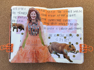
This spread I made for Julia and her Fox spirit!


I still had Julia's journal when we had the solar eclipse in North America. While I wasn't near totality here in New York, I thought id be interesting to capture how the sun looked at a certain time on that day. I'll always remember how the sun glowed. 

I also love that on the last page, we all added which month we worked in the journal. What a great to close it out.  I can't wait to see how everyone's final pages before we share our own completed journals. Please check out everyone else's pages: Julia, Vanessa, Lauren, Riet, Moriah and Lauren.


Tuesday, October 17, 2017

Printing with Foam Plates

This is just a super casual tutorial for using foam printing plates. I first came across these plates in collage, as a kid friendly introduction to printmaking. The brand I'm using is Inovart and you can read more about their Presto Foam Printing Plates here. What I love about them is all you need to make your impression is a pencil. I even tried using the handle of a palette knife, so you don't have to worry about sharp carving tools. 


I'm using water soluble print ink from Blick and Speedball. Water soluble ink makes for easier clean up and a faster dry time than oil based printing inks. Besides the drawing utensils you'll also want palette paper, to roll my ink out on, brayers and some paper to print on. A scissor is also good to cut down the plates and even cut them into shapes. 


I started by first brainstorming some shapes that I might want to "carve." Think about repeated symbols that show up in your work. This would be a great way to make a plate that you can reuse with those images. Also magazine images of faces are great too.


For using the magazine image, the carving process is basically just tracing. You can see my first tracing in the middle and I just decided to retrace it to thicken and deepen the lines. This step may have been unnecessary because you'll see that even the slight crease in the foam ends up getting printed, so you really just need the lightest indentation.


Since I have two brayers, I made sure to use one for ink and the other to burnish. 


And here's the first print!  You can see that all the details come through and honestly I was surprised with how clean the image came out. 


I made three more plates and this time I drew directly into the foam with pencil. I also used the handle of the palette knife on the eye, and you can see the lines are thicker, but also not as clean when printed. But I ended up going back over that one to deepen the lines. 


These plates are also great for making collage elements as they are great to print on a variety of paper. Here I printed on tissue paper, marbled paper, old book paper and some mixed media paper that I had color swatches on. 


And again because the ink is water soluble, the plates are easy to clean and reusable. 


Also don't forget to print directly into your journal! This is a great way to play with layers and repeated imagery. 

I'd even try this technique out with kids fun foam, which then might be printable with stamping ink. 

I'm so glad that I held onto these foam sheets. I can see myself making a lot of theses plates. They are easier to carve than stamps, but can be thought of the same way. I love how imperfect the line quality is versus manufactured stamps. And more importantly, how personal they can be. 


Monday, September 18, 2017

Colour Blast - Yellow

I've always loved yellow. It started as my go to "pick me up" color, and has become a staple in my palette. And working in Riet's journal made me love it all the more.


I've really come to enjoy using this technique for using up my scraps. Especially scraps of hand painted paper. Though simple, it definitely adds a lot of energy. 


Days, weeks, and now months after I made this spread I still scroll back into my camera roll to look at this spread. It's has to be one of the spreads that I'm most happy with. Everything just flowed while making this one. 


I had three bottles of yellow paint laying on my desk and decide to swatch them all! Yellow is really lovely and fun. 


I'm  always looking up color/emotion associations. So I paired them with a photo I had taken at the New York Botanical Gardens. 


We're getting to end of our Colour Blast journey. Most of the journals have completed the circle and we have just one more color to share. Be sure to check out all the other additions added this round by Vanessa, Riet, Lauren Brown, Lauren Blood, Moriah, and Julia

Tuesday, August 15, 2017

Colour Blast - Red

The Colour Blast collaboration took a little break because we had quite a few members traveling this summer. It was fun watching everyone's adventures, but now I get to share my pages in Moriah's Red Journal. Just a reminder, the others artists in the collab are Vanessa, Julia, Lauren Brown, Lauren Blood, Riet and Moriah.

My relationship with the color red has had an interesting journey. I used to stay far away from it. I saw red as this loud, in your face color, when all I wanted to do was go unnoticed. I saw it as the color of strength and being in charge during a time when I didn't feel strong or in control. Not until I started to study the Chakras did my attitude toward red change and a true appreciation and love for it come forward. Now I associate red so strongly with my Root Chakra. It's become my grounding color. The color I use when I need to be reminded of my place, that I have a place, and my personal power. The color that proves I'm a woman and connects me to the women of my past. My mom has always loved the color red.


So I wasn't at all surprised when these spreads started to share the theme of self love and acceptance.