I love using watercolors but I've found that I keep reaching for my pan watercolor sets because they are so easy to use. This meant that this pile of watercolor tubes was getting neglected and I can't have that!

While I already have premade pan sets, I liked the idea of going through my tube watercolors and making a palette of my favorite colors. I bought this Meeden palette with 24 half pans, because I didn't want to limit my colors.

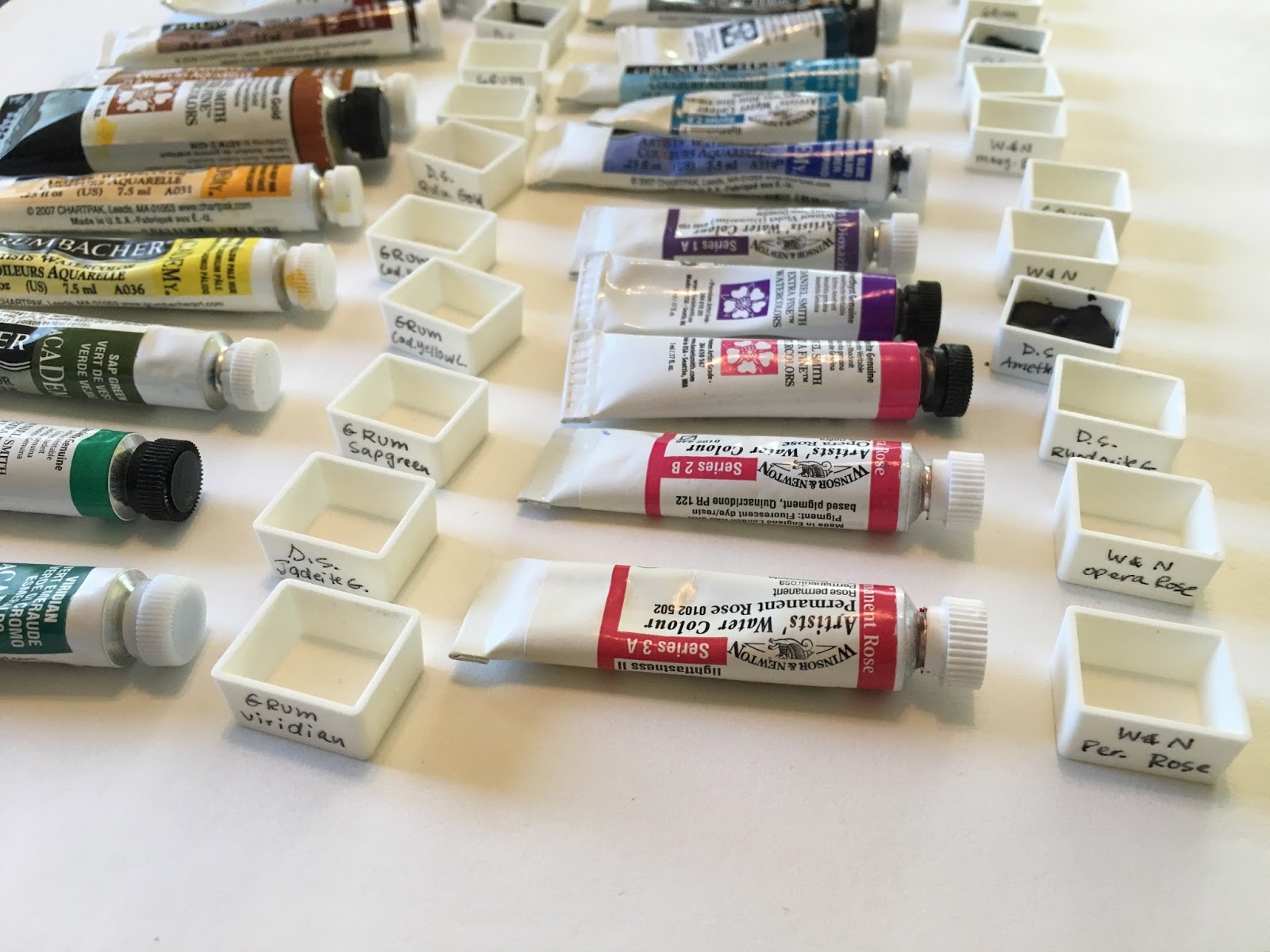
I first narrowed down my colors. I found that I have double of a lot of these Grumbacher tubes, which means I never checked my supplies before buying the set again... While these are student grade paints, they do make up the bulk of my basic and traditional colors. I choose Grumbacher Sap Green, Viridian, Thalo Blue, Ultramarine Blue, Burnt Sienna, Yellow Ocher Hue, Yellow Pale Hue, Cadmium Yellow Deep Hue, Cadmium Red Light Hue and Alizarin Crimson.

I had a few more blues and reds of these Winsor & Newton tubes, but narrowed them down to these favorites. These are Winsor & Newton Ivory Black, Winsor (Dioxazine) Purple, Manganese Blue Hue, Quinacridone Red, Opera Rose, and Permanent Rose.

Daniel Smith! I totally splurged on these. I bought the Quinacridone Gold and the Primatek set, which is made of Piemontite Genuine, Hematite Genuine, Mayan Blue Genuine, Jadeite Genuine, Rhodonite Genuine and Amethyst Genuine.

I had previously switched out all these colors, so I used those to make a master swatch set in my Get Messy Season of Colour journal.

Once I had the colors in order I gave each tube a half pan and wrote the name of the color on the side of the pan.

This way, if I ever need to refill the pan, I know the color!
I found the paint came out much easier when I held onto the end of the tube and pushing the paint into the corner of the pan.

I went around filling the pans this way until almost full. I wasn't concerned with fully filling the pans or making them perfectly flat on top.

The process went by pretty quickly once I got the technique down. It was interesting to make note of which colors where more thick in consistency and I wonder if it has to do with the pigment used.

I noticed some pretty quickly stated to dry on the top, especially the Daniel Smith ones. I'm letting them dry in the palette because I don't want to worry about dust drying on top.

Once I had my pans filled I spent some time color mixing. The page on the right is figuring out the debate between the traditional primaries of Yellow, Red, Blue or the primary set our printers use, Yellow, Magenta, and Cyan. The Yellow for both sets is Grumbacher Yellow Pale Hue, the Red is Grumbacher Cadmium Red Light Hue and the Blue is Grumbacher Ultramarine Blue. For Magenta I used Winsor & Newton Permanent Red and Cyan is Grumbacher Thalo Blue.
I first did a straight mixing of the primaries going across and then mixed the secondary colors as well. The YMC primaries defiantly give you the brighter, more traditional secondaries and it was interesting to see just how different they are.

This will probably become the set that I travel with. I can even add some more half pans to the center if I ever pick up some more tube paints.
I am very interested in making my own water colors. I recently bought handmade set for so much money and was sorely disappointed with quality to chalky and dull and paint rubbed off. I investigated on u tube and found easy ways of making with instructions Haven't tried. Love your work. I follow u on insta. I am minniecar❤️🌈
ReplyDelete